Punishing Places
Spatial Capabilities and Bayesian Methods for Transforming Community Supervision in Utah
March 6, 2026
Dissertation Architecture
Each chapter builds on the limitations of the prior: critique → baseline → evidence → policy
Chapter 1
Theoretical Framework
Spatial Capabilities
Chapter 2
Frequentist Replication
Simes’ Punishing Places Framework
Chapter 3
Extension
Spatial Bayesian Model
Chapter 4
Policy
Spatial Policy Targeting
➡️ Ch. 2’s residual spatial autocorrelation → motivates Ch. 3’s Spatial Bayesian methodology
➡️ Ch. 3’s coefficient contributions → feed Ch. 4’s targeting framework
Three Research Questions: Where, Why, What to do about it
RQ 1: Where?
How is the correctional supervision population spatially distributed across Utah communities?
RQ 2: Why?
What is the spatial relationship between community conditions and capability deprivations (place-based deficits)?
RQ 3: What now?
How can spatial Bayesian methods inform place-based policy interventions?
Research Motivation: The Empirical Puzzle
Why does punishment concentrate in specific places?
Vast spatial heterogeneity in Utah: Adjacent census tracts — same laws, same law enforcement, same sentencing guidelines — exhibit radically different supervision rates.
Well-designed individual programs consistently produce null results (Doleac, 2019).
This dissertation argues that the answer lies in community conditions — the place-based factors that shape what residents can actually achieve. These conditions are identifiable, measurable, and most importantly, modifiable.
Community supervision rate per 1,000 individuals by census tract. The contrast between deep red and yellow tracts is the puzzle motivating this dissertation.
The Stakes: Why does this matter?
💡 This dissertation provides the evidence base for where, what, and how to invest in community conditions to reduce community supervision rates.
- Research gap: Most studies focus on prison admissions from urban areas, while most people in the system are on community supervision. Occuring increasingly in non-metropolitan areas.
- 49,829 supervision episodes across 708 census tracts (2016–2023)
- 128 high-risk tracts where supervision concentrates at rates up to 35× the state average
- Current Policy Context: increased supervision vs health/social services
$130M for 768 new prison beds in Utah
Utah 2026 proposal (Baird, 2026)
$195M RHTP — invest in community conditions that can prevent criminal justice contact over the next 5 years
Rural Health Transformation Plan
CHAPTER 1
Place as Conversion Factor:
A Spatial Capabilities Framework for Understanding the Geography of Community Supervision
The Causal Inversion
Neoclassical Economics
Individual Choices
↓
Aggregate to Crime Rates
↓
Community Supervision Rates = Sum of Individual Decisions
Policy: Change individual incentives
Spatial Capabilities
Behavior Emerges Within Constrained Possibilities Embedded in Space
↑
Shape Capability Sets
↑
Community Conversion Factors
Policy: Transform community conditions
🏡 ⚖️ Someone tethered to the CJ system in a community with robust transportation, accessible healthcare, dignified jobs, and strong collective efficacy faces a fundamentally different capability set than one returning to institutional withdrawal and environmental degradation.
Spatial Capabilities Theory: Place as Multidimensional Conversion Factor
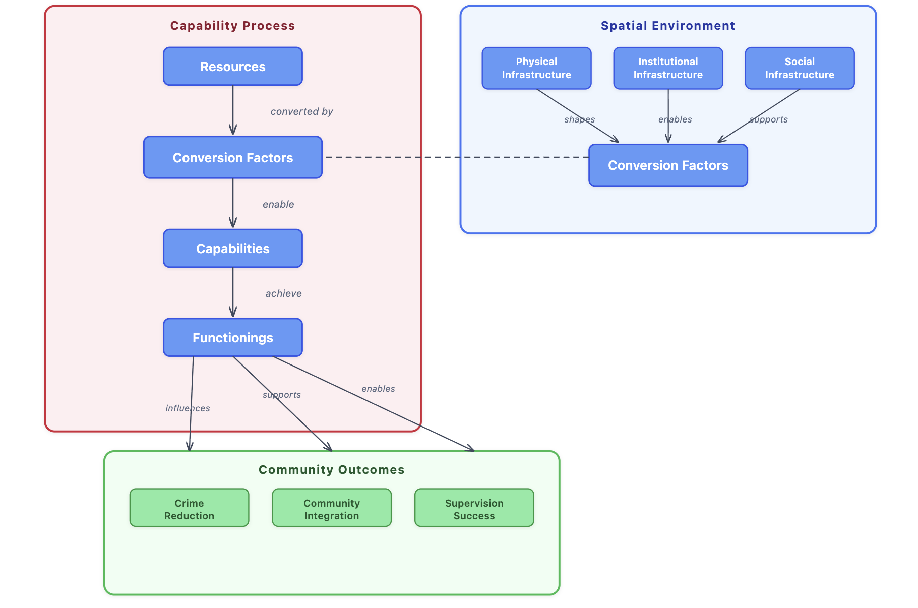
Place = multidimensional conversion factor — it shapes which conversion factors exist. No clinic, no bus route, no community college, no childcare → no conversion.
Resources × Conversion Factors → Capabilities
A credential without transportation to employers is not a capability. The conversion step is where place enters.
Community Outcomes (bottom): Crime reduction, community integration, and supervision success emerge from capability formation — not solely from individual deterrence.
The spatial trap: Outcomes feed back into the spatial environment — incarceration depletes the very conversion factors communities need, deepening the cycle.
Three Forms of Spatial Capability: In Practice
INDIVIDUAL
Personal mobility & spatial agency — the ability to access opportunities across geographic space
In rural Utah, limited public transportation severely constrains access to employment, treatment, and supervision compliance — a returning citizen without a car cannot reach a parole office 45 miles away
COLLECTIVE
Community-level capacities achieved only through coordinated action — collective efficacy, mutual trust, resource mobilization
Sampson (2012): Neighborhoods with high collective efficacy produce lower crime rates regardless of poverty — this is a community property, not an individual one
CROSS-BOUNDARY
Resources accessed beyond one’s own community — when what you need doesn’t exist where you live
Geographic isolation becomes a form of capability deprivation
💡 These three forms operate across different scales — and φ = mixing parameter in the empirical analysis directly tests the collective dimension
Bridging Theory to Method
What the Theory Predicts 🔎
Spatial capabilities theory makes testable empirical claims:
- Correctional supervision concentrates spatially — not randomly
- Specific conversion factors drive that concentration — not generic disadvantage
- Neighboring communities share capability profiles — spatial dependence is real
- Different communities have different binding constraints
Simes, Beck & Eason (2025): Spatial concepts and methodologies remain underutilized in criminal justice research — this dissertation responds to that research gap.
CHAPTER 2
Punishing Places in Utah
Replicating & Extending Simes’ Punishing Places
Simes’ Punishing Places (2021)
The Most Thorough Spatial Analysis
Simes documents the geographic transformation of American punishment — from large cities to smaller cities, towns, and rural communities.
Key findings from Massachusetts:
15% of tracts → 52% of prison admissions
Moran’s I = 0.30 — strong spatial clustering of prison admissions
Concentrated disadvantage explains much, but significant spatial structure persists
| Element | MA | UT |
|---|---|---|
| Outcome | Prison admits | Supervision |
| N tracts | 1,359 | 708 |
| Land area (mi²) | 10,554 | 84,899 |
| Moran’s I | 0.30 | 0.40 |
| Concentration | 15%→52% | 21%→50% |
| Disadvantage | +31% | +28.5% |
Adopts Simes, Beck, & Eason’s (2024) “spatial-contextual approach” — examining both place-based social processes within local areas and spatial relationships between them
Why Utah? A Critical Case Study
Utah’s combination of metropolitan–rural contrast, rapid prison growth, and healthcare infrastructure deficits creates a natural laboratory for testing whether community conditions predict the geographic concentration of correctional supervision
despite declining crime rates (Pew, 2017)
technical violations driving prison growth
vast rural landscape with dispersed services
The majority of the community supervision population consists of people on probation who have never been incarcerated — yet place-based research almost exclusively studies prison admissions. First study of Utah.
Data Pipeline
Variables & Sources
| Variable | Source | Years | Obs. |
|---|---|---|---|
|
Community supervision (probation & parole) |
Utah DOC | 2016–2023 | 86,734 → 49,829 |
| Concentrated Disadvantage Index (PCA) | |||
| Poverty rate (% families) | ACS 5-Yr | 2017–2021 | 709 tracts |
| Unemployment rate | ACS 5-Yr | 2017–2021 | 709 tracts |
| Female-headed HHs w/ children | ACS 5-Yr | 2017–2021 | 709 tracts |
| Adults without HS degree | ACS 5-Yr | 2017–2021 | 709 tracts |
|
|
ACS 5-Yr | 2017–2021 | 709 tracts |
| Demographic Controls | |||
| % NH Black, % Hispanic, % NH Asian | ACS 5-Yr | 2017–2021 | 709 tracts |
| % Foreign born | ACS 5-Yr | 2017–2021 | 709 tracts |
| % Residential mobility (new residents) | ACS 5-Yr | 2017–2021 | 709 tracts |
Key Difference from Simes
Simes measures prison admissions. This dissertation measures community supervision (probation and parole), capturing the broadest reach of correctional control (3.7M nationally vs. 1.8M incarcerated).
If supervision alone concentrates in the same disadvantaged places, place is already shaping criminal justice outcomes before anyone enters prison.
Concentrated Disadvantage Index ⭐
PCA following Sampson et al. (1997): % families in poverty, % unemployment, % female-headed households, % no HS degree.
Utah adaptation: public assistance dropped (loading = 0.31) — reflects LDS Church welfare substitution and rural access barriers. Sensitivity: 5-var/4-var correlation = 0.979
Ch. 2 Methodology: Model Specification
Negative Binomial Regression
log(E[Yi]) = log(Popi) + β₀ + β₁Disadvantagei + β₂Regioni + β₃Demographicsi + β₄TreatmentCenteri + εi
| Component | What It Captures |
|---|---|
| log(E[Yi]) | Expected supervision count in tract i — log-link ensures positive predictions; coefficients exponentiate to rate ratios (e.g., exp(0.251) = 1.285 → +28.5%) |
| log(Popi) | Offset — converts counts to rates so tracts are comparable regardless of population |
| Disadvantagei | Standardized PCA index: poverty, unemployment, female-headed HH, no HS degree |
| Regioni | Varies by specification (A–D) |
| Demographicsi | % NH Black, % Hispanic, % NH Asian, % foreign born, % new residents |
| TreatmentCenteri | Residential facility proximity control |
| εi | NB error with dispersion θ (variance ≈ 28× mean) |
Spatial-Durbin (SLX) Extension (Model E)
log(E[Yi]) = … + β₁Xi + β₂(WX)i + εi
| Term | Meaning |
|---|---|
| Xi | Own-tract disadvantage |
| (WX)i | Neighbors’ average disadvantage |
| W | Queen’s contiguity matrix, row-standardized |
Tests whether collective capabilities cross tract boundaries — does the disadvantage of surrounding neighborhoods independently predict a tract’s supervision rate?
Ch. 2 Five Model Specifications: Results
| Model | Regional Term | Source | Disadv. RR | Key Regional Finding | ΔAIC | Moran’s I |
|---|---|---|---|---|---|---|
| A: Simes 4-Region | SL, Wasatch, Secondary, Rural | Simes (2018a) | 1.285 | Rural RR = 1.626 (p < 0.01); 4-region p = 0.056 | ref | 0.326 |
| B: LHD | 13 health districts | Utah DHHS | 1.229 | SE Utah RR = 3.718, TriCounty RR = 3.295; F = 2.95 | −24.3 | 0.287 |
| C: RUCA | Metro, Micro, SmallTown, Rural | USDA ERS | 1.280 | Metro RR = 0.679 (−32.1%***); Micro, SmallTown n.s. | worst | 0.313 |
| D: Full | 4-Region + RUCA | Combined | 1.277 | Regional effects hold; no RUCA category significant | −18.7 | 0.320 |
| E: SLX | 4-Region + neighbors’ disadv. | Extension | 1.196 | Neighbors’ RR = 1.440***; Rural persists RR = 1.495 | −41.0 | 0.335 |
Model fit: LHD outperforms all geographic schemes — institutional infrastructure matters more than administrative boundaries. Concentrated Disadvantage remains the dominant structural predictor. Each standard deviation increase is associated with 22.9% higher correctional supervision rates. [SLX best → LHD → Full → Simes → RUCA]
*RR = exp(coefficient): exp(0.179) = 1.196 means +19.6% per SD
AIC balances how well the model fits the data against how many parameters it uses
Persistent autocorrelation: Spatial spillovers capture variation that regional classifications cannot. Moran’s I = 0.287–0.335 across all models (MA benchmark: 0.30). No categorical classification fully captures continuous spatial processes → motivates INLA-BYM2 in Ch. 3.
Moran’s I measures spatial autocorrelation — whether nearby tracts have more similar residuals than expected by chance. Values near 0 = random; positive = neighbors resemble each other.
Ch. 2 Key Insight: Neighbors Matter
A 1 SD increase in neighbors’ averaged concentrated disadvantage is associated with a 44% higher supervision rate, after controlling for own-tract disadvantage, demographics, and region.
The Decomposition
Where you are surrounded by matters more than where you are. Model E reveals neighbors’ disadvantage (β = 0.365) is more than double the own-tract effect (β = 0.179).
Model A’s 28.5% increase blends both — Model E separates them: 19.6% from own-tract conditions, 44.0% independently from neighbors’. Standard models miss this because they treat each tract as if it exists in isolation.
What This Validates
Collective capabilities are real. Shared labor markets, transportation networks, institutional catchment areas — conversion factors operate at geographic scales larger than individual census tracts.
Even after accounting for neighbors’ disadvantage, nearby tracts still look more alike than they should (Moran’s I = 0.335) ➡️ Something else is spatially clustered beyond just disadvantage: 🏞️, 🏥, 🚌, 📚 These are the conversion factors Chapter 3 will identify.
Ch. 2 → Ch. 3 Bridge 🌉
Four Contributions
Disadvantage concentrates punishment universally — comparable in MA (+31%) and UT (+28.5%) despite different geographies
LHD boundaries outperform all regional classifications — institutional (health) infrastructure shapes punishment geography
Neighborhood spillovers are substantial — SLX validates collective capabilities theory (1.440 vs. 1.196)
Extractive post-industrial rural — Rural elevation persists even after accounting for neighboring conditions
“When places lose the conditions people need to stay out of the criminal justice system, incarceration concentrates there”
CHAPTER 3
An Empirical Portrait of Punishing Places:
Spatial Bayesian Analysis of Place-Based Capabilities
Why Integrated Nested Laplace Approximations – Besag-York-Mollié 2 (INLA-BYM2)?
Ch. 2 Established ✅
- Disadvantage predicts supervision
- The models explain that disadvantage matters, but the errors still cluster on the map — nearby tracts over- and under-predict together (Moran’s I ≈ 0.29–0.34)
- Neighbors matter (SLX: RR = 1.440)
Ch. 2 Cannot ❌
- Identify which conversion factors
- Model spatial dependence precisely
- Decompose spatial vs. non-spatial variation
- Provide tract-specific guidance
Ch. 3 Advances
| Ch. 2 Limitation | Ch. 3 Solution |
|---|---|
| Composite disadvantage | 22 individual conversion factors |
| Regional fixed effects | BYM2 spatial random effects |
| Frequentist estimation | Full Bayesian posteriors |
| Statewide predictions, no tract-level residual adjustment | Tract-specific residual adjustments |
| Single model | 9 specs across 3 datasets |
Why Bayesian?
Instead of just asking “is this significant?” (p < 0.05), Bayesian credible intervals answer a more useful question: how big is the effect, and how sure are we? Policymakers need to know the plausible range — not just a point estimate and a yes/no threshold.
Ch. 3 Data Pipeline
Data Sources & Coverage
| Source | Variables | Coverage |
|---|---|---|
|
Utah DOC Supervision episodes |
Probation & parole counts (2016–2023) |
49,829 episodes 35,052 individuals 716 tracts |
|
Utah HPI Healthy Places Index |
8 domain scores + disaggregated indicators (education, transport, environment, housing, social) | 702 tracts |
|
ACS 5-Year 2017–2021 |
Educational attainment, MHI, homeownership, cost burden, living alone | 709 tracts |
|
GeoDaCenter Health metrics |
Diabetes, obesity, physical activity, poor health days, cognitive difficulty | 450 tracts |
|
EPA EJ Environmental Justice |
Diesel particulate matter concentrations | 702 tracts |
All continuous variables z-scored to enable cross-domain comparison. Coefficients represent effect of 1 SD change.
Three Model Specifications
Full Coverage (n = 689)
22 predictors from ACS + HPI + EPA. Maximizes geographic representation. Primary specification. DIC = 5,247.3
Partial Coverage (n = 450)
39 predictors adding GeoDaCenter health metrics. Best overall fit (DIC = 3,460.4) but limited geographic scope.
HPI Domain Scores (n = 689)
9 composite domain indices. Parsimonious alternative — tests whether broad domains suffice for policy. DIC = 5,270.8
Variable Selection
Bayesian Model Averaging evaluates all 90+ candidate predictors simultaneously (50K iterations), ranking each by its probability of belonging in the true model — but spatial autocorrelation is removed first so that BMA selects variables on substantive merit rather than geographic proximity, before INLA-BYM2 reintroduces proper spatial structure.
The Integrated Nested Laplace Approximation-BYM2 Model
What makes a tract’s supervision rate higher or lower than the statewide expectation?
matched the state average
conditions
spatial processes
unique factors
log(RRi) = β₀ + Σβjxij + ui + vi → exp(·) = RRi
RRi is the model’s best estimate of each tract’s true underlying risk — combining everything measured with everything unmeasured, smoothed to filter out noise from small populations. RR = 1.5 means 50% above the state average.
Level 1: Data Model
yi ~ Poisson(Ei · θi)
Level 2: Process Model
log(θi) = β₀ + Σβjxij + ui + vi → exp(·) = RRi
| Symbol | Meaning |
|---|---|
| β₀ | Intercept — statewide baseline supervision rate |
| Σβjxij | Measured conversion factors (education, income, diabetes…) |
| ui | Structured spatial effect — collective capabilities shared with neighbors |
| vi | Unstructured effect — this tract’s unique, unmeasured characteristics |
| RRi | Relative Risk — combined effect of all components, smoothed for sampling noise |
Coefficients exponentiate to relative risk: exp(β) = 1.5 means 50% higher supervision rate per SD increase.
Bayesian credible intervals tell policymakers: “We are 95% confident the true effect falls here” — not just whether p < 0.05.
The spatial random effects (ui + vi) capture everything the measured conversion factors miss — and the BYM2 decomposition tells us how much of that residual is spatially structured.
Ch. 3: BYM2 Decomposition — Do Neighborhoods Matter?
The model specification included uᵢ + vᵢ — but how much of the unexplained variation is shared between neighbors vs. unique to each tract?
φ tells you the balance
networks, institutions crossing boundaries
here, a local employer there
After measuring 22 conversion factors, neighboring tracts still look alike — neighborhoods matter
Ch. 1 theorized collective capabilities. Ch. 2’s SLX showed neighbors matter (RR = 1.440). φ = 0.51 confirms it — and tells policy at what scale to act:
Stress tested. Six regional controls added — φ never decreases. Not confounding.
Regions mediated. LHD boundaries significant in raw data but worsen fit when added. Conversion factors explain what jurisdictions cannot.
Better measurement → lower φ. Full: 0.51 → Health-enriched: 0.23 → Composites: 0.86.
Ch. 3: Robust Conversion Factor Effects
| Conversion Factor | Direction | Effect Range | Robustness |
|---|---|---|---|
| Educational attainment (bachelor’s) | 🛡️ | −13.5% to −21.9% | ★★★ All 3 specs |
| Median household income | 🛡️ | −9.2% to −12.1% | ★★★ All 3 specs |
| Living alone (social isolation) | ⬆ | +19.5% to +28.4% | ★★★ Full + Partial |
| Diabetes prevalence | ⬆ | +20.8% to +26.9% | ★★★ Full + Partial |
| Walkability index | ⬆ | +2.3% to +2.9% | ★★ |
| Clean environment (HPI) | 🛡️ | −26.7% | ★★ |
| Social domain (HPI) | 🛡️ | −24.6% | ★★ |
| Transportation (HPI) | 🛡️ | −11.0% | ★★ |
| Limited physical activity | ⬆ | +45.4% | ★ |
🛡= Protective. Effect ranges = % change in supervision rate per SD. ★★★ = credible in 2+ specifications; ★★ = credible in 1. All shown achieve 95% Bayesian credibility (CI excludes zero).
- Each conversion factor is a policy lever — a specific, addressable community condition
Ch. 3: The Geography of Risk
Risk clusters in both urban cores and rural extraction regions. ➡️ Relative Risk = tract supervision rate relative to statewide average. RR of 2.0 = double expected; 0.5 = half expected.
Urban Core
Salt Lake (46), Weber (13)
Rural Extraction
Carbon (5), Duchesne (4), Uintah (3)
Suburban
Utah County (14)
| Region | N | % |
|---|---|---|
| Salt Lake | 46 | 46% |
| Utah | 14 | 14% |
| Weber | 13 | 13% |
| Uinta Basin | 7 | 7% |
| Carbon | 5 | 5% |
128 high-risk tracts / 689 (18.6%). P(RR > 1.5) exceeds 80%
Top: RR = 35.85 (SL 1025.02)
Ch. 3: Exceedance Probabilities — Where to Invest?
The model doesn’t just estimate which tracts are high-risk — it tells us how confident we are. Exceedance integrates both magnitude and confidence (Medina et al. 2022). These tiers group tracts by the probability that their rate truly exceeds double the state average: Tiers translate model uncertainty into actionable 📍 investment categories.
| Tier | P(RR>2.0) | Tracts | Population | Supervised | Mean RR | RR Range | Action |
|---|---|---|---|---|---|---|---|
| 🔴 Red | 80–100% | 59 | 224,490 | 14,084 | 4.68 | 2.13–35.85 | Comprehensive (3.0×) |
| 🟠 Orange | 50–79% | 10 | 46,162 | 1,465 | 2.09 | 2.01–2.18 | Targeted (2.0×) |
| 🟡 Yellow | 20–49% | 11 | 44,348 | 1,304 | 1.92 | 1.86–2.00 | Prevention (1.5×) |
| 🟢 Green | <20% | 609 | 2,949,000 | ~29,000 | 0.76 | 0.10–1.88 | Maintain (1.0×) |
P(RR > 2.0) = how confident is the model that this tract’s rate is at least double the state average?
This gives us a spatially precise framework for policy investment ➡️ Ch. 4
| County | Tracts | Profile |
|---|---|---|
| Salt Lake | 34 | Social isolation, poverty, diesel PM |
| Weber | 10 | Post-industrial — education deficits |
| Carbon | 5 | 100% Red — post-extraction collapse |
| Duchesne | 4 | Uinta Basin — rural + industrial |
Dual concentration confirmed. Red tracts cluster in Salt Lake’s urban core (social isolation pathway) and rural extraction counties (education deficit pathway). Same tier, different interventions.
Carbon County: 100% of tracts Red — a county-wide capability deficit from post-extraction economic collapse.
Why exceedance? A tract with RR = 2.1 but wide uncertainty differs from RR = 2.0 with narrow uncertainty. Exceedance integrates both magnitude and confidence.
CHAPTER 4
From Punishing Places to Capability-Enabling Places
A Policy Framework for Organized Spatial Investment
Ch. 3 → Ch. 4: The Policy Translation 🧭
What Chapters 1–3 Established
Punishment concentrates in places where conversion factors constrain what residents can achieve — where education is depleted, health infrastructure is absent, social connections are fractured, and environmental burdens accumulate.
These are modifiable features of the built and social environment — not fixed characteristics of the people who live there.
INLA provides targeted policy guidance: tract-specific diagnoses of which conversion factors drive risk where — not just that disadvantage matters, but that education matters most in Carbon County while social isolation matters most in Salt Lake’s urban core.
Chapter 4 Addresses
Where to invest
Exceedance probability tiers rank 689 tracts by confidence-weighted risk → 59 Red, 10 Orange, 11 Yellow
What to target
Coefficient contributions decompose each tract’s risk into specific conversion factors → different tracts, different interventions
How to deliver
Intervention archetypes matched to local conversion factor profiles → no one-size-fits-all
At what scale
φ = 0.51 means both tract-level targeting and regional coordination — neither alone is sufficient
With what protections
Care/control safeguards ensure place-based investment doesn’t become place-based surveillance
Ch. 4: Coefficient Contribution Analysis
Two tracts can have the same overall risk but need completely different interventions.
How It Works
For each tract, multiply the statewide coefficient by that tract’s local value:
Contributionij = βj × xij
of factor j
local value
factor adds here
RR tells you where to invest. Contributions tell you what to invest in. Together they are the direct input for Ch. 4’s targeting framework.
Same Tier, Different Interventions
Salt Lake Tract 1025.02 (RR = 35.85)
Policy: Social infrastructure — community centers, third places, peer support networks
Weber Tract 2018 (RR = 20.08)
Policy: Health + education — community health workers, workforce development, food access
This is targeted public policy. Generic “invest in disadvantaged communities” cannot distinguish between these two tracts. Contribution analysis can. ➡️ Policy Chapter 4
Live Demo: Risk Factor Decomposition
If iframe doesn’t load, open utah-spatial-maps.netlify.app/policy_risk_driver_map in a new tab.
Policy Relevance: Already in Practice
📍️ Utah is already using place-based targeting for juvenile justice — the same framework this dissertation develops for adult supervision.


KUER 90.1 | Feb 6, 2026
Ogden hopes a successful Magna program can reduce youth crime in Weber County
The parallel: Utah CCJJ identified 100 neighborhoods as priorities for juvenile justice intervention — based on where youth live, not where crimes occur. Four of the top six hotspots are in Ogden — the same Weber County tracts this dissertation flags as Red Zone.
What this dissertation adds: The CCJJ analysis identifies where. Spatial capabilities theory explains why and prescribes what — matching specific conversion factor deficits to targeted interventions.
Conclusion: The Policy Choice
Path A: $130M
768 new prison beds
(Utah 2026 proposal — Baird, 2026)
⚠️ Manages consequences of community disinvestment
Path B: $195M RHTP
Community conditions that prevent CJ contact
(RHTP alignment — federal funding)
✅ Addresses conversion factor deficits at their source
What distinguishes this framework from prior place-based proposals is that every recommendation is grounded in empirical evidence and anchored in a theoretical framework. The analysis mapped 689 tracts, identified 128 as high-risk, and regional analysis that are calibrated to the specific conversion-factor deficits documented by the spatial models. This is a precise specification of which communities need what investments and why.
SYNTHESIS
Contributions & Future Directions
Three Contributions
1. Theoretical: Place Matters
Criminal justice outcomes aren’t just shaped by who lives somewhere — they’re shaped by what the place provides. Spatial capabilities theory reframes disadvantaged communities as places where conversion factors constrain what residents can achieve.
2. Empirical: First Spatial Bayesian Analysis of Supervision & in Utah
Utah is the first non-metropolitan state analyzed with INLA-BYM2 for correctional supervision. Key findings: 128 high-risk tracts identified, φ = 0.51 confirms collective capabilities are real, and the dual concentration pattern (urban cores + rural extraction regions) challenges the assumption that punishment is an urban phenomenon.
3. Actionable Policy: Precise Targeting
Coefficient contribution analysis tells policymakers not just where to invest but what to invest in — tract by tract. Two tracts in the same Red Zone can need completely different interventions. This is policy tool to navigate investment decisions and deeper investigation in high-risk communities.
Limitations
Every empirical finding in this dissertation should be interpreted within these boundaries:
Cross-sectional design
All findings are associations, not causal claims. We cannot test whether improving conversion factors actually reduces supervision — that requires longitudinal data.
Ecological inference
Tract-level patterns do not describe individuals. However, the spatial capabilities framework argues the ecological level is the appropriate unit — we are studying what places provide, not what individuals do.
Proxy measures
Collective efficacy — central to the theoretical framework — is proxied through voting and census participation rather than directly measured.
Utah specificity
Demographic context (LDS influence, low racial diversity, vast rural geography) limits direct transferability. The framework generalizes; the specific coefficients may not.
Incomplete geographic coverage
Health metrics available for only 450 of 716 tracts. The partial coverage model achieves best fit but cannot represent the full state — hence three specifications rather than one.
Reverse causality
Holaday, Simes & Wang (2025) show supervision concentrations worsen community health — meaning cross-sectional health estimates likely understate true protective effects.
Future Research
Causal Identification
RHTP phased rollout as natural experiment
Staggered implementation across tiers enables difference-in-differences design — the first causal test of whether improving conversion factors reduces supervision concentration.
Natural experiments
Medicaid expansion and extractive industry shocks (mine closures, oil price collapses) provide exogenous variation to test whether healthcare access and economic disruption causally affect supervision rates.
Multi-state extension
Replicate across states with different demographic and institutional contexts to test whether the spatial capabilities framework — and φ’s balanced finding — generalizes beyond Utah.
Community Validation
Participatory qualitative research
Models identify deficits but cannot capture lived experience. Community members in Red Zone tracts should validate whether the conversion factors identified match what they experience as barriers. ➡️ In Progress
UDC research partnerships
Richer outcome data — recidivism, employment post-supervision, program completion — would test whether place-based interventions improve individual trajectories, not just area-level rates. ➡️ Currently being implemented
These quantitative frameworks are empirically informed starting points — community voice must validate and guide implementation of policy priorities.
From Punishing Places to Capability-Enabling Places
🏡 The conversion factors driving correctional supervision concentration are modifiable features of the built and social environment.
factors constrain capabilities
identified by coefficient analysis
to conversion factor needs
“Where people live shapes what people can become. This dissertation provides the empirical architecture, but the communities themselves must determine which freedoms matter most and which investments would most effectively convert formal opportunities into the real capabilities that constitute human flourishing.”
Thank you. Questions?
BACKUP SLIDES
Theoretical Lineage: Key Sources
The Framework’s Intellectual Architecture
| Tradition | Key Author(s) | Core Concept | Dissertation Application |
|---|---|---|---|
| Capabilities approach | Sen (1999), Nussbaum (2011) | Resources ≠ capabilities without conversion factors | Place as multidimensional conversion factor |
| Neighborhood effects | Sampson (2012), Wilson (1987) | Durable spatial differentiation | Collective efficacy as collective spatial capability |
| Punishment geography | Simes (2021), Eason (2017) | Spatial concentration of incarceration | Utah replication & rural extension |
| Stratification economics | Darity (2022), McKay & Darity (2024) | Intergroup competition produces inequality | Conversion factor deficits are structured, not random |
| Feminist economics | Folbre (2001), Braman (2004) | Care labor as foundational economic activity | Incarceration destroys care infrastructure |
| Critical geography | Gilmore (2007), Harvey (2009) | Organized abandonment / spatial fix | Punishing places as produced, therefore transformable |
| Environmental justice | Manduca & Sampson (2019, 2021) | Pollution → developmental harm → incarceration | Diesel PM as conversion factor deficit |
| Heterodox labor economics | Myers & Sabol (1987), McGahey (1986) | Structural unemployment → CJ involvement | RBPE critique of rational choice |
What Spatial Capabilities Theory Adds
The original contribution is integrating these traditions through the capabilities framework — treating place not as a background variable but as the mechanism that converts (or fails to convert) resources into real freedoms. No existing framework connects all six literatures; this dissertation does.
The Spatial Capabilities Framework

- The person returning from incarceration to a community with robust transportation, accessible healthcare, and strong collective efficacy faces a fundamentally different capability set than one returning to institutional withdrawal, environmental degradation, and violence exposure.
The Spatial Capabilities Framework v.2

Why Not Rational Choice?
The Inter-Disciplinary Critique
Becker (1968): Crime as rational cost-benefit calculation under certainty. Predicts that increasing punishment severity reduces crime.
Empirical problems: Doleac (2019) reviews the evidence and finds that most deterrence-based interventions show limited or null effects. Severity of punishment has little deterrent effect; certainty of punishment matters more, but even this operates through spatial mechanisms (police presence varies by neighborhood).
Simes & Jahn (2022): Medicaid expansion — a health policy, not a criminal justice intervention — reduced arrests by 20–32%. This is the largest effect in the criminal justice RCT literature. The conversion factor approach explains why: healthcare access enables capability formation that deterrence-based approaches cannot.
Myers & Sabol (1987): Radical Black Political Economy challenges the assumption that criminal justice involvement reflects individual choice, arguing instead that labor market segmentation and structural unemployment produce patterns of involvement that rational choice models cannot explain.
McGahey (1986, 1987): Demonstrates that local labor market conditions — not individual human capital — determine employment and offending patterns. The “crime-unemployment” relationship operates through spatial mechanisms.
The Causal Inversion
Neoclassical: Individual deficits → criminal behavior → incarceration → spatial concentration
Spatial capabilities: Community conditions → constrained capability sets → inability to avoid CJ system → concentrated punishment reinforces conditions
Data Pipeline
Geocoding
- 86,734 raw records → 44,650 geocoded addresses (51.5% match rate). Multi-stage process: primary geocoding through Census Bureau, secondary matching through ArcGIS for addresses that failed initial geocoding. 709 census tracts as unit of analysis (2020 boundaries).
Key Difference from Simes
- Simes measures prison admissions — the deepest end of the CJ system. This dissertation measures community supervision (probation and parole) — the broadest reach. Utah’s 5.6M supervision population dwarfs the ~1.9M incarcerated population nationally. Finding comparable spatial concentration at the probation stage implies the spatial trap operates before imprisonment’s additional deprivations.
PCA & Concentrated Disadvantage Index Detail
Factor Structure Comparison
| Component | MA Loading | UT (5-var) Loading | UT (4-var) Loading |
|---|---|---|---|
| % Poverty | >0.60 | Strong | Strong |
| % Unemployment | >0.60 | Strong | Strong |
| % Female-headed HH | >0.60 | Moderate | Moderate |
| % No HS degree | >0.60 | Moderate | Moderate |
| % Public assistance | >0.60 | 0.31 (weak) | Excluded |
| Eigenvalue | >3.0 | 1.68 | 1.86 |
| Variance explained | >60% | 33.6% | 46.5% |
Why Public Assistance Loads Weakly in Utah
- LDS Church welfare programs substitute for government assistance; rural access barriers require hours of travel to county offices; stricter TANF eligibility and shorter benefit durations; cultural norms discouraging government assistance. Hager (2021, ProPublica) documents how “Utah makes welfare so hard to get, some feel they must join the LDS Church to get aid.”
Sensitivity Analysis
- 5-variable / 4-variable correlation: r = 0.979. PCA / simple summation correlation: r = 0.995. Substantive findings are invariant to reasonable alternative specifications. The 4-variable index is the primary specification.
Theoretical Significance
- The weaker factor structure is substantively meaningful, not a methodological problem. It demonstrates that concentrated disadvantage manifests differently in non-metropolitan Western contexts — disadvantage still clusters, but indicators don’t march in lockstep the way they do in segregated Northeastern cities.
Ch. 2 Demographic Controls Detail
Model A: Five Demographic Composition Variables
| Variable | IRR | p-value | Interpretation |
|---|---|---|---|
| % Non-Hispanic Black | 1.033 | 0.013 | Significant positive |
| % Hispanic | 1.016 | <0.001 | Significant positive |
| % Non-Hispanic Asian | 0.981 | 0.178 | Not significant |
| % Foreign Born | 0.996 | 0.781 | Not significant |
| % New Residents | 1.014 | <0.001 | Significant — coercive mobility |
| Treatment Center | 1.615 | <0.001 | Institutional control |
How the SLX Reframes Race
In every model (A–D), Hispanic and Black population shares significantly predict higher supervision rates. Once neighbors’ disadvantage enters the model (Model E):
Hispanic effect disappears entirely (IRR drops to 1.007, n.s.)
Black effect declines to marginal significance
This suggests racial composition partly proxies for the broader spatial context of compounding regional disadvantage. Racial stratification and economic disadvantage are not independent predictors but interlocking mechanisms through which place constrains capability formation.
Residential Mobility
- Remains significant even in the SLX model (IRR = 1.010, p < 0.001), consistent with Clear’s (2007) “coercive mobility” framework — the constant churning of people through jails, prisons, and supervision destabilizes neighborhoods.
Simes Comparison Detail
Full Model Results Comparison
| Model | Coeff. | SE | RR | 95% CI | Moran’s I |
|---|---|---|---|---|---|
| A: Simes 4-Region | 0.251 | 0.031 | 1.285 | [1.210, 1.365] | 0.326 |
| B: LHD | 0.207 | 0.033 | 1.229 | [1.152, 1.311] | 0.287 |
| C: RUCA | 0.247 | 0.031 | 1.280 | [1.204, 1.360] | 0.313 |
| D: Full Model | 0.245 | 0.031 | 1.277 | [1.202, 1.357] | 0.320 |
| E: SLX (own) | 0.179 | 0.033 | 1.196 | [1.122, 1.275] | 0.335 |
| E: SLX (neighbors) | 0.365 | 0.053 | 1.440 | [1.299, 1.597] | — |
- Key divergence: Utah’s concentrated disadvantage effect (19.6%–28.5%) converges with Simes’ Massachusetts finding (~31%), confirming the universality of the relationship. Utah’s Moran’s I (0.287–0.335) closely parallels Simes’ MA benchmark (0.30). The SLX model yields the highest Moran’s I (0.335) despite explicitly modeling neighbors — spatial dependency operates through mechanisms beyond disadvantage clustering.
Regional Classification Effects
- Simes’ 4-region classification fails significance in Utah (p = 0.056). LHD boundaries outperform all classifications (ΔAIC = 24.3 over Model A). RUCA urbanicity achieves metropolitan significance only after demographic controls — demographic composition suppresses the metropolitan-rural difference.
San Juan County: The Jurisdictional Exception
Highest Disadvantage, Lowest Supervision
- San Juan County, home to the Navajo Nation, presents a notable exception: despite having the highest concentrated disadvantage scores in the state, it exhibits the lowest LHD-level supervision rate (RR = 1.202, not statistically significant).
Why This Matters
- This apparent paradox likely reflects jurisdictional complexity — tribal justice systems operate independently of state correctional authority. The Navajo Nation maintains its own courts, police, and corrections system. Residents subject to tribal jurisdiction would not appear in state supervision data.
Theoretical Implication
- San Juan illustrates how institutional structure mediates the disadvantage-punishment relationship. The same level of disadvantage produces different correctional outcomes depending on which justice system has jurisdiction. This validates the spatial capabilities framework’s emphasis on institutional infrastructure as a conversion factor.
Backup: A.3 Variable Definitions by Source
A.3.1 Utah Healthy Places Index & Composite Variables
| Variable | Definition | Source |
|---|---|---|
| automobile | % occupied housing units with vehicle access | ACS 2015-2019 |
| bachelorsed | % population 25+ with bachelor’s degree or higher | ACS 2015-2019 |
| bikeaccess | Miles of bike lanes and paths per capita | Utah Geospatial Resource Center |
| censusresponse | 2020 Census cumulative self-response rate (proxy for collective efficacy) | 2020 Census |
| dieselpm | Diesel particulate matter concentration (μg/m³) | EPA EJSCREEN |
| employed | % civilian population 16+ employed | ACS 2015-2019 |
| homeownership | % occupied housing units owner-occupied | ACS 2015-2019 |
| houserepair | % occupied units lacking complete plumbing or kitchen | ACS 2015-2019 |
| insured | % civilian noninstitutionalized population with health insurance | ACS 2015-2019 |
| ozone | Mean summer ozone concentration (ppb) | EPA EJSCREEN |
| parkaccess | % population within 0.5 miles of a park | Utah Geospatial Resource Center |
| pm25 | Annual mean PM2.5 concentration (μg/m³) | EPA EJSCREEN |
| treecanopy | % land area covered by tree canopy | NLCD 2019 |
| uncrowded | % occupied housing units with ≤1 occupant per room | ACS 2015-2019 |
| voting | Voter turnout rate in most recent general election | Utah Lt. Governor |
| walkability | National Walkability Index score | EPA Smart Location Database |
| transit | % workers commuting by public transit | ACS 2015-2019 |
| retail | Retail employment accessibility index | Utah HPI |
| supermkts | % population beyond 1 mi (rural) / 0.5 mi (urban) from supermarket | USDA Food Access Research Atlas |
| libraryaccess | Avg distance to nearest public library (pop-weighted) | Utah Geospatial Resource Center |
| HTA | Housing + transportation costs as % of income | CNT.org H+T Index |
| LIHTC_HU | Low-Income Housing Tax Credit units per 1,000 housing units | HUD LIHTC Database |
| LEB | Life expectancy at birth (years) | CDC USALEEP 2015 |
HPI Composite Domain Scores
| Variable | Definition | Source |
|---|---|---|
| education | Education domain composite score | Utah HPI |
| economic | Economic domain composite score | Utah HPI |
| social | Social domain composite score | Utah HPI |
| transportation | Transportation domain composite score | Utah HPI |
| neighborhood | Neighborhood domain composite score | Utah HPI |
| housing | Housing domain composite score | Utah HPI |
| healthcare | Healthcare Access domain composite score | Utah HPI |
| clean_enviro | Clean Environment domain composite score | Utah HPI |
A.3.3 Census ACS Variables
| Variable | Definition | Source |
|---|---|---|
| punemp | Unemployment rate (% civilian labor force) | ACS 2015-2019 |
| ppov | Poverty rate (% population below poverty line) | ACS 2015-2019 |
| pfemhh | % households headed by females with children | ACS 2015-2019 |
| pchldrn | % population under age 18 | ACS 2015-2019 |
| MedinAg | Median age of population | ACS 2015-2019 |
| MHI | Median household income (dollars) | ACS 2015-2019 |
| GiniCff | Gini coefficient of income inequality (0–1) | ACS 2015-2019 |
| phisp | % population Hispanic/Latino | ACS 2015-2019 |
| ppa | % population receiving public assistance | ACS 2015-2019 |
| labor_participation | Labor force participation rate | ACS 2015-2019 |
| job_availability | Jobs per working-age population within commuting distance | LEHD/LODES |
| ownsevere | % owner-occupied units with severe cost burden (>50% income) | ACS 2015-2019 |
| rentsevere | % renter-occupied units with severe cost burden (>50% income) | ACS 2015-2019 |
| VacantP | Housing vacancy rate (%) | ACS 2015-2019 |
| NoIntP | % households without internet access | ACS 2015-2019 |
| inhghsc | % population 25+ with high school diploma or equivalent | ACS 2015-2019 |
| inprsch | School enrollment rate for population 3+ years | ACS 2015-2019 |
A.3.4 Categorical Classification Variables
| Variable | Definition | Source |
|---|---|---|
| UrbanType | Urban-rural classification: Urban Area, Urban Cluster, or Rural | Census Urban Area Definitions |
| Rurality | Urban Influence Code categories (1–12 collapsed) | USDA ERS |
| NeighbTyp | Neighborhood typology classification (1–6 types) | GeoDaCenter/HPI Composite |
A.3.5 Outcome & Derived Variables
| Variable | Definition | Source |
|---|---|---|
| corr_pop | Count of individuals under correctional supervision in tract | Utah DOC |
| corr_rate | Correctional supervision rate per 1,000 adult population | Calculated (UDC + ACS) |
| corr_pp | Correctional supervision proportion (% adult population) | Calculated (UDC + ACS) |
| expected | Expected count based on statewide rate × tract population (offset) | Calculated |
| treatment_center | Binary indicator (0/1) for residential treatment facility in tract | Utah DOC |
A.4.1 BMA Variable Evidence Summary
| Variable | Capabilities Domain | Evidence Tier | PIP |
|---|---|---|---|
| dieselpm | Environmental Justice | Strong |
0.95 |
| censusresponse | Collective Efficacy | Strong |
0.90 |
| automobile | Transportation Access | Strong |
0.85 |
| insured | Healthcare Access | Strong |
0.80 |
| bachelorsed | Educational Attainment | Strong |
0.80 |
| NeighbTyp_5 | Neighborhood Typology | Strong |
0.85 |
| employed | Economic Opportunity | Moderate | 0.60–0.75 |
| houserepair | Housing Quality | Moderate | 0.55–0.70 |
| homeownership | Economic Stability | Moderate | 0.50–0.65 |
| HTA | Housing + Transportation | Moderate | 0.50–0.65 |
| punemp | Economic Distress | Suggestive | 0.40–0.55 |
| ppov | Economic Distress | Suggestive | 0.35–0.50 |
| voting | Civic Engagement | Suggestive | 0.30–0.45 |
| traffic | Environmental Exposure | Suggestive | 0.25–0.40 |
PIP = Posterior Inclusion Probability from Bayesian Model Averaging (50K iterations, Zellner-Siow priors). Strong ≥ 0.75; Moderate ≥ 0.50; Suggestive ≥ 0.25. All continuous variables z-standardized prior to analysis.
BMA Variable Selection Detail
Evidence Tiers from Posterior Inclusion Probabilities
| Tier | PIP Range | Variables | Examples |
|---|---|---|---|
| Strong | > 0.75 | 8 | Education, income, homeownership |
| Moderate | 0.50–0.75 | 5 | Unemployment, poverty, female HH |
| Suggestive | 0.25–0.50 | 9 | Diesel PM, transit, insurance |
| Theoretical | < 0.25 | 11 | Retained for policy relevance |
Two-Stage Spatial Filtering
- Stage 1: Spatial lag regression residuals remove autocorrelation — Moran’s I: 0.44 → −0.06
- BMA on spatially-filtered residuals: 50,000 iterations, Zellner-Siow null priors, uniform model priors
- Applied separately to 3 datasets: full (689 tracts, 50 predictors), partial (450 tracts, 60 predictors), HPI (689 tracts, 10 indices)
Why Retain Theoretical Variables?
Environmental justice indicators, healthcare access, and transportation had PIPs below 0.25 but were retained because excluding them would be a theoretical decision masquerading as a statistical one. The BMA selects for predictive power; the spatial capabilities framework requires testing specific theoretical claims about conversion factor domains.
INLA-BYM2 Model Specifications
| Dataset | Model | N Tracts | Predictors | DIC | WAIC | φ |
|---|---|---|---|---|---|---|
| Full | full_suggestive | 689 | 22 | 5,247 | 5,129 | 0.51 |
| Full | full_moderate | 689 | 15 | 5,259 | 5,141 | 0.54 |
| Full | full_strong | 689 | 8 | 5,272 | 5,148 | 0.58 |
| Partial | partial_suggestive | 450 | 39 | 3,460 | 3,382 | 0.23 |
| Partial | partial_moderate | 450 | 18 | 3,471 | 3,393 | 0.29 |
| Partial | partial_strong | 450 | 11 | 3,482 | 3,401 | 0.35 |
| HPI | hpi_full | 689 | 9 | 5,271 | 5,145 | 0.86 |
| HPI | hpi_selected | 689 | 6 | 5,283 | 5,157 | 0.88 |
| HPI | hpi_domains_only | 689 | 8 | 5,278 | 5,151 | 0.84 |
Prior specs: PC priors P(σ > 0.5) = 0.01, neutral mixing P(φ < 0.5) = 0.5, Zellner-Siow on fixed effects. Queen’s contiguity adjacency matrix following Simes.
Model Selection Rationale
Full_suggestive selected as primary: maximizes geographic coverage (689 tracts, 96.2%), achieves best DIC/WAIC among full-coverage models, retains policy-relevant suggestive-tier variables. The partial model has superior fit but covers only 450 tracts (63%) — insufficient for a framework claiming statewide applicability.
Regional Sensitivity Analysis
Six Regional Classification Tests
| Classification | Regional Dummies | ΔDIC | Δφ | Core Coefficients |
|---|---|---|---|---|
| None (baseline) | 0 | ref | ref | Stable |
| RUCA 4-category | 3 | −0.8 | +0.012 | Stable |
| Simes 4-region | 3 | −1.1 | +0.018 | Stable |
| 9-region detailed | 8 | −2.4 | +0.021 | Stable |
| Local Health District | 12 | −1.3 | +0.028 | Stable |
| Urban Influence Code | 4 | −0.6 | +0.015 | Stable |
| County (29) | 28 | −5.1 | +0.034 | Stable |
Three Key Findings
1. Conversion factors fully mediate regional effects. LHD dummies produce significant raw differentiation (F = 2.95, p < 0.001), yet adding them worsens model fit (ΔDIC = −1.3). What appears to be “jurisdictional effects” is entirely explained by place-based conversion factors.
2. φ is genuine, not confounded. Across all six specifications, φ increases slightly (+0.012 to +0.034) rather than decreasing when regional controls are added. If spatial effects were confounded by regional characteristics, adding dummies would absorb this structure.
3. Dual concentration is not an artifact. Elevated correctional rates persist in both urban disadvantaged and rural extraction regions across all specifications.
Partial Coverage Model: Health Metrics
Additional Effects from GeoDaCenter Data (n = 450)
| Variable | β | RR | % Effect | Direction |
|---|---|---|---|---|
| Limited physical activity | 0.374 | 1.454 | +45.4% | ⬆ Risk |
| Living alone | 0.250 | 1.284 | +28.4% | ⬆ Risk |
| Diabetes prevalence | 0.189 | 1.208 | +20.8% | ⬆ Risk |
| Obesity prevalence | 0.122 | 1.130 | +13.0% | ⬆ Risk |
| Poor physical health | −0.472 | 0.624 | −37.6% | ↓ Counterintuitive |
| Bachelor’s degree | −0.184 | 0.832 | −16.8% | 🛡️ Protective |
| Life expectancy | −0.062 | 0.940 | −6.0% | 🛡️ Protective |
| MHI | −0.126 | 0.882 | −11.8% | 🛡️ Protective |
Counterintuitive Finding: Poor Physical Health (−37.6%)
Communities with higher poor physical health have lower supervision rates. Mechanisms: (1) older/disabled populations reflecting the age-crime curve; (2) healthcare system engagement — communities where residents report health problems may have better provider access; (3) compositional vs. contextual — poor health reflects who lives there, not what places provide.
Why φ Drops to 0.23
The partial model’s richer variable set captures more of the substantive drivers of geographic variation, leaving residual effects that are predominantly local and idiosyncratic. More variables → more explained spatial structure → lower φ. This confirms that what cruder models attribute to mysterious “neighborhood effects,” disaggregated measures explain.
Conversion Factor vs. Functioning Distinction
Operationalizing the Theoretical Framework
| Category | Examples | Behavior Under Sensitivity | Interpretation |
|---|---|---|---|
| Robust conversion factors | Education (−20.6%), Income (−12.5%), Homeownership (−9.3%), Social isolation (+18.7%) | Stable across all specs and all 6 regional tests | What places provide — genuine environmental, social, and economic conditions |
| Specification-sensitive functionings | Diabetes (+26.9%/+20.8%), Physical activity (+45.4%), Diesel PM (+9.6%) | Sensitive to regional controls or dataset | What characterizes who lives there — compositional differences reflecting health status or selective migration |
Why This Matters for Policy
Robust conversion factors are the actionable policy targets — they capture modifiable features of the built and social environment that operate regardless of regional location. Specification-sensitive functionings are upstream indicators — they signal that conversion factor deficits are producing poor health outcomes, but the intervention should target the underlying conversion factors (food environment, recreational infrastructure, emissions enforcement), not the health outcomes themselves.
The HPI Model Confirms This
The HPI model uses composite domain scores (φ = 0.86, σ = 0.457) — most variation is attributed to “neighborhood effects.” The full model uses disaggregated indicators (φ = 0.51, σ = 0.216) — those effects are explained by specific conversion factors. Composite measures obscure the mechanisms policy must address.
Ch. 4: Interactive Policy Maps
Policy Targeting Maps
1. Priority Neighborhoods by Region — Top 100 by relative risk
2. Risk Factor Decomposition — Which specific factor drives risk in each priority tract
Convergent Evidence
3. Where Evidence Converges — Multi-model, multi-variable convergence → highest-confidence targets
4. Tract Risk Profile Dashboard — All 689 tracts × 17 predictors × 3 models
Dissertation Defense · Sheena Yoon · University of Utah · 2026